A typeface that represents the Rakuten Group
Four font styles to express the unity and diversity of the Rakuten brand in a broader and better way.
We created the four font styles each with a distinct personality, based on the form of the Rakuten logo. This diverse range of options allows us to select the fonts best suited to our message, opening avenues for more effective communication.
Discover the key features in more detail
Language coverage
The Rakuten Sans & Serif now cover almost all European languages. The font styles are upgraded with a complete all European Latin & Cyrillic Glyph set.
- Afar
- Afrikaans
- Albanian
- Asturian
- Asu
- Basque
- Belarusian
- Bemba
- Bena
- Bini
- Bube
- Catalan
- Cebuano
- Chiga
- Colognian
- Cornish
- Cree
- Embu
- Danish
- Dutch
- Estonian
- Faroese
- English
- Finnish
- French
- Friulian
- Ga
- Galician
- Ganda
- German
- Gusii
- Icelandic
- Inari Sami
- Indonesian
- Interlingua
- Irish
- Italian
- Javanese
- Jenaama Bozo
- Jju
- Jola-Fonyi
- Kabuverdianu
- Kalaallisut
- Kalenjin
- Kamba
- Kikuyu
- Kinyarwanda
- Lepcha
- Lisu
- Lithuanian
- Low German
- Lower Sorbian
- Lü
- Luo
- Luxembourgish
- Luyia
- Machame
- Makhuwa-Meetto
- Makonde
- Malagasy
- Manx
- Meru
- Morisyen
- Nigerian Pidgin
- North Ndebele
- Northern Sami
- Northern Sotho
- Northern Thai
- Norwegian Bokmål
- Norwegian Nynorsk
- Nyanja
- Nyankole
- Occitan
- Oromo
- Portugese
- Romanian
- Romansh
- Romeo
- Rundi
- Russian
- Rwa
- Sahi
- Kamburu
- Sango
- Sangu
- Scottish Gaelic
- Sena
- Shambala
- Shona
- Sidamo
- Soga
- Somali
- Soninke
- South Ndebele
- Southern Sotho
- Spanish
- Sranan Tongo
- Swahili
- Swati
- Swedish
- Swiss German
- Tai Nüa
- Taita
- Taroko
- Teso
- Tiv
- Tsonga
- Tswana
- Tyap
- Upper Sorbian
- Vunjo
- Walloon
- Walser
- Welsh
- Western Frisian
- Xhosa
- Zulu
Variable font
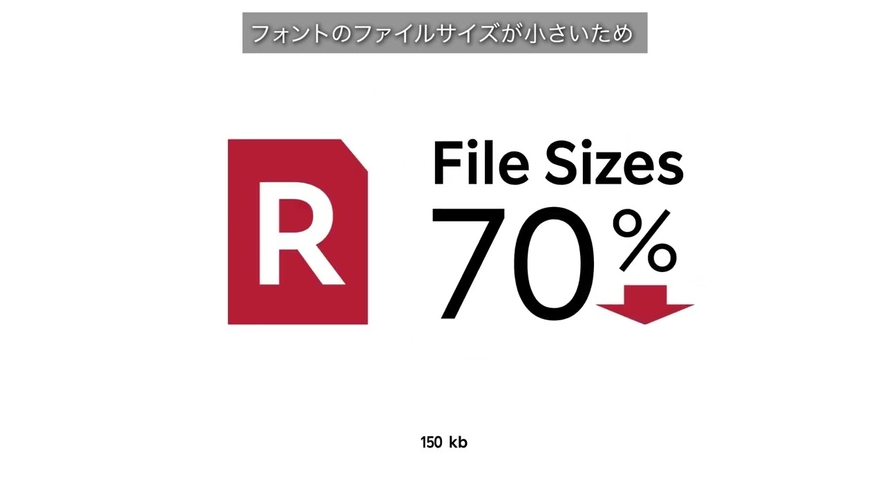
For each of the font styles we created a Variable Font. The Variable Font technology makes all weights of a certain style accessible through one single file, resulting in a smaller file size. They also allow the user to select any intermediate value between the static font weights, through variation on a continuous weight (Wt) axis.
Advance usage
Smaller file size for better performance
Discover the four styles and all of their details
Rakuten Sans is a sans serif design designed with a combination of expression and functionality in mind. Like the previous Rakuten corporate typeface, it is a geometric sans serif design: the tapering shape of its spurs is a tribute to that typeface.
The open counters preserve legibility at smaller sizes; and yet the slightly flaring terminals to its curved strokes gives the face sharpness and personality. The upright styles are accompanied by true italic matching fonts, cursive in construction in order to achieve best contrast when used alongside the upright, for instance to create emphasis.
The upright styles are accompanied by true italic matching fonts, cursive in construction in order to achieve best contrast when used alongside the upright, for instance to create emphasis.
Character set
Rakuten Sans
ARakuten Sans Italic
ARakuten Condensed
ARakuten Serif
ARakuten Serif Italic
ARakuten Rounded
A
Time to play around
Rakuten x Dalton Maag
Rakuten Font was developed with Dalton Maag, a London-based typeface design studio that has developed numerous world-class corporate fonts. We invite you to watch the video of a conversation between Rakuten and Dalton Maag detailing this effort. More video content will be added as they become available.


